Welcome to the new and improved Agnes Wright! Take a look around, and hang out for a while!
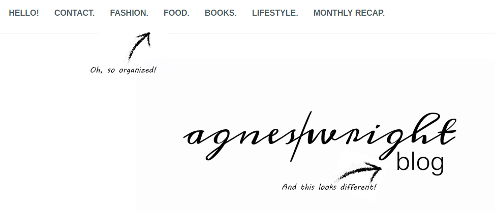
Now that my posts have added up, I wanted to create a better experience for my followers and visitors by improving navigation thru the site. Don’t want you to miss a thing!
Here’s a quick orientation.

A header menu was high on my list while looking for a new theme to customize. As my collection of posts grow, it is important to stay organized for all of you. So, instead of digging through the blog roll for my latest recipe or shopping spree, you can simply use the food and fashion links at the top. But always feel free to dig around before you leave!
I’ve also been going back and forth with logo ideas the past few weeks. As I keep developing my blog-o-sphere and expanding in Etsy, I wanted the logo to be diversified. Being literal is key, here!

You can also get around using my sidebars – and now there are two! For easier viewing, of course. Here, I will keep the trusty category cloud for more specific topics, the search bar, Instagram feed, follower sign up (hint, hint!) and more.. if you keep scrolling! There is sure to be more added here as I continue to grow content. Don’t be a stranger!
Can you tell I’m a little excited about the new layout? It feels right. It feels legit. It’s time to create more content. Let’s get to work!
So, what do you think?! Have you ever done a makeover for your own blog?
Enjoy.
xoxo. a


This is such a cute blog post idea for when you have a refurb! It looks amazing and I love your header. Gorgeous style – simple! xx
http://www.lexilife95.wordpress.com
Thanks so much! I’m so much happier with this layout and feel refreshed! Simple is best in my book 🙂